Case Study 01
Redesigning an UX/UI design system for a home maintainance platform
- ClientRezigo Ltd
- SectorProperty, PropTech, Comparison website
- My RoleDesigning all new UX/UI elements for the website and app
- SkillsFigma, HTML5, CSS3, JavaScript, JQuery, Adobe Creative suite
- Project Time20 months
- Established2022
Introduction
In February 2022 I joined Rezigo Ltd, as the Head of Design. It was up to me to lead the update on their design system and add new interface designs to their existing web platform. I was also responsible for designing and producing all the marketing material, such as leaflets, posters, signage, business cards as well as videos. In addition, I designed and created platform demos, animations with illustrations and stock video.
Challenge
When I first encountered the design for their original platform, it wasn't something I found to be particularly modern. I was immediately motivated to transform and upgrade their branding and design system.
The main challenge I faced was to make the design and functionality changes as the existing pages were already in place, and to convert a user base that knew how to navigate the site. Implementing a massive change would be disruptive and would also cause user confusion. I therefore planned to make smaller iterative updates to various UI elements gradually to ensure a smoother transition.
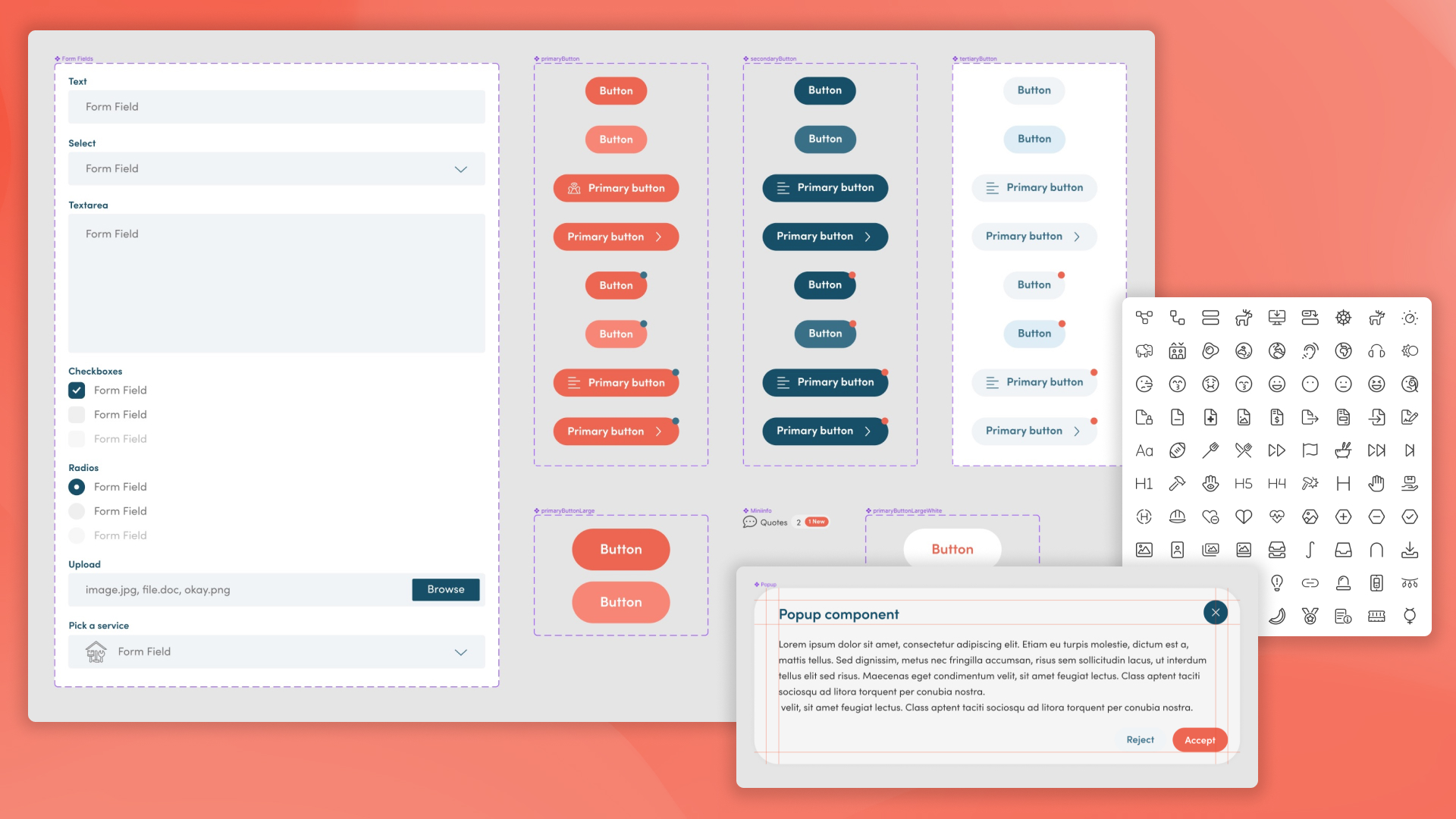
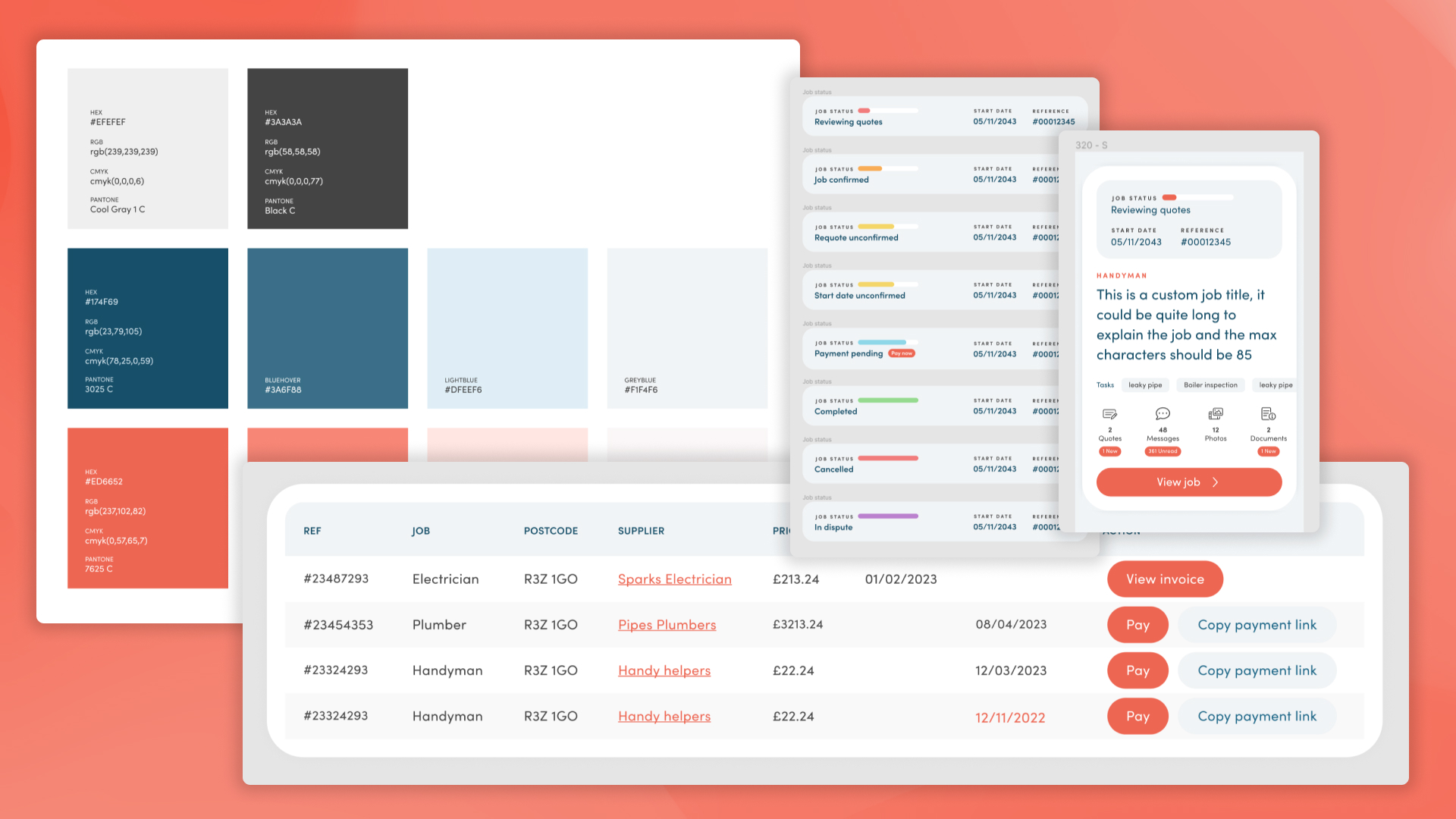
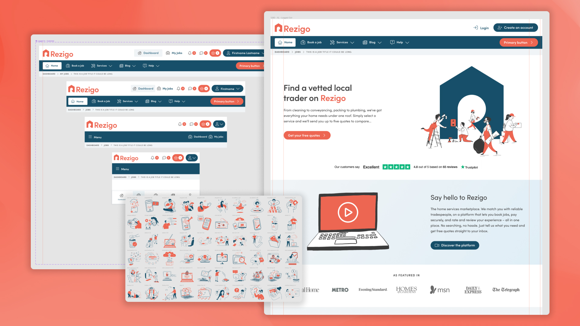
Design system
Below you can see elements of the new UI, I made sure I set out a defined rule set for margins, padding, font sizes and colours, all being kept consistent throughout. I used Figma components to rapidly create more layouts and make the relevant pages. Any additional elements were created and then later added into the design system and saved as a component for later use.
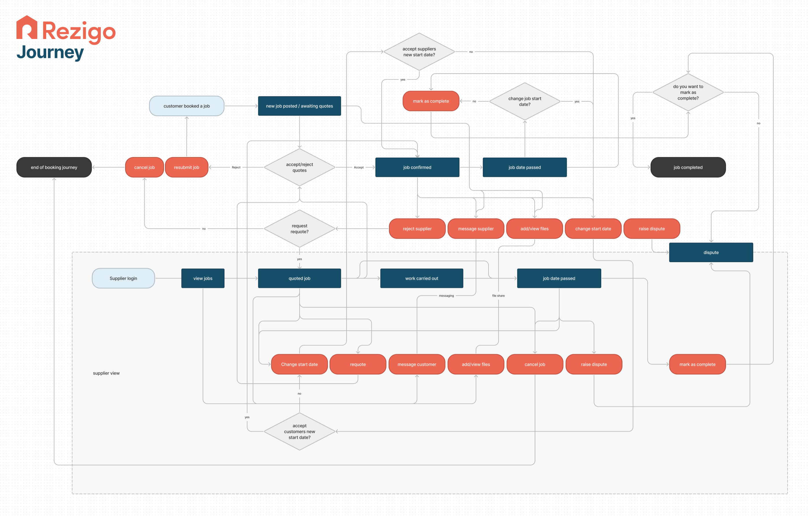
User journey
I wanted to get a deeper understanding of the journey a typical user would take, and all the options and variables that they could face. I designed this flow diagram based on the current user journey, hoping to gain insight into approaches to streamline the flow resulting in a quicker and more seamless experience for the user.
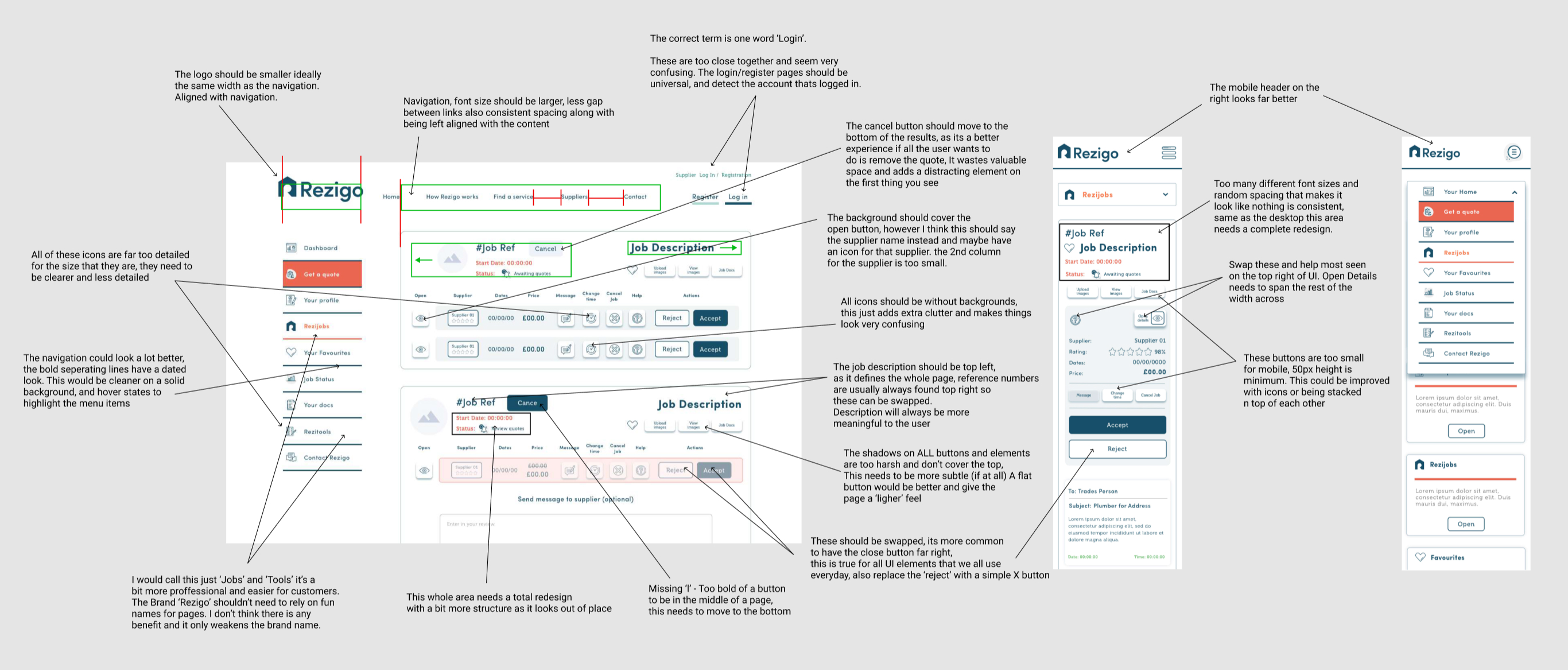
Analysing the current jobs page
I knew there was a great amount of work that needed to be done to bring the design up to a modern standard, as features had been bolted on by request and the developers never had time to rethink the layout. They instead opted for the easier approach of adding more buttons and information in areas where there was space. This resulted in an unclear site where the design suffered.
In the image below you can see the original platform where I identified multiple design elements that needed to be fixed/improved or removed all together.
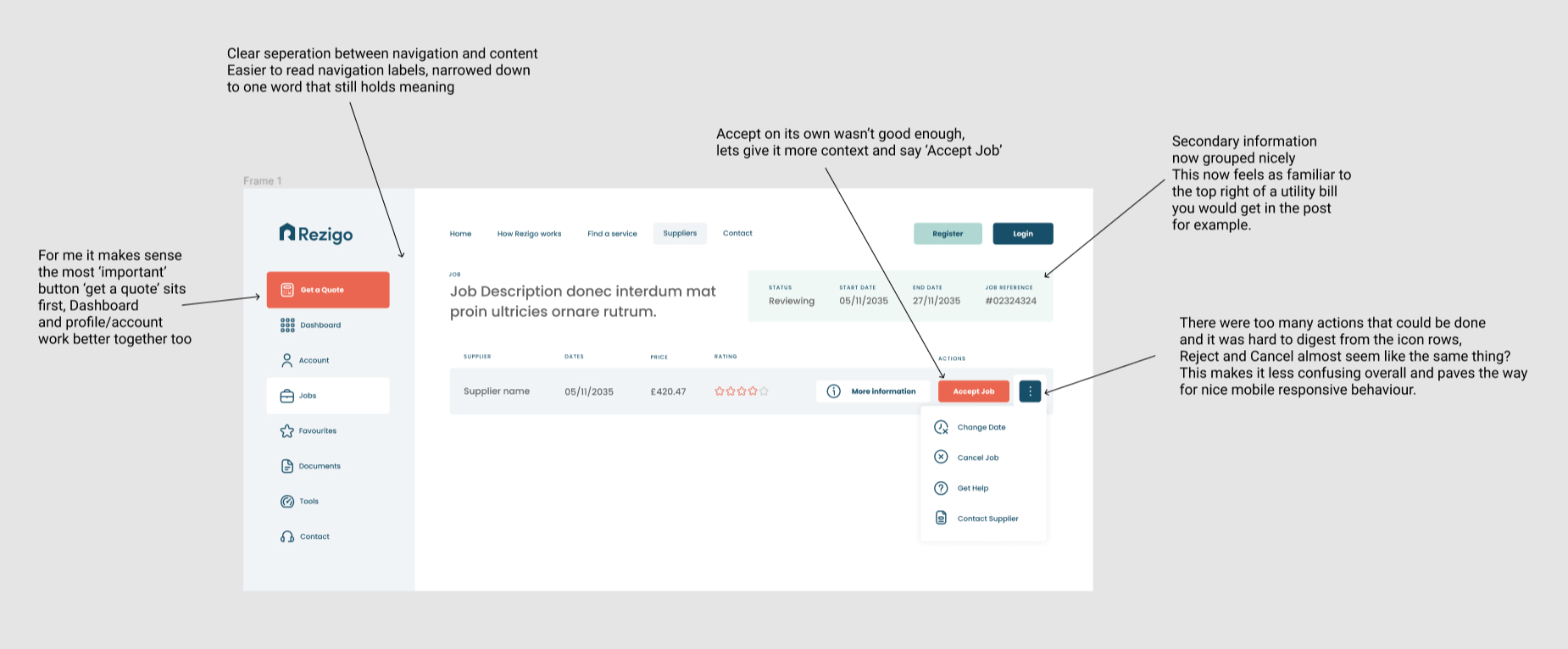
Designing the new concept
I had to declutter the original platform, so I narrowed down the most essential information that user needed in order to proceed to the next step, leaving them fewer choices, makes for a clearer user journey.
Huge design changes, such as increasing white space and adding more consistency, has produced a far more functional and aesthetically pleasing interface.
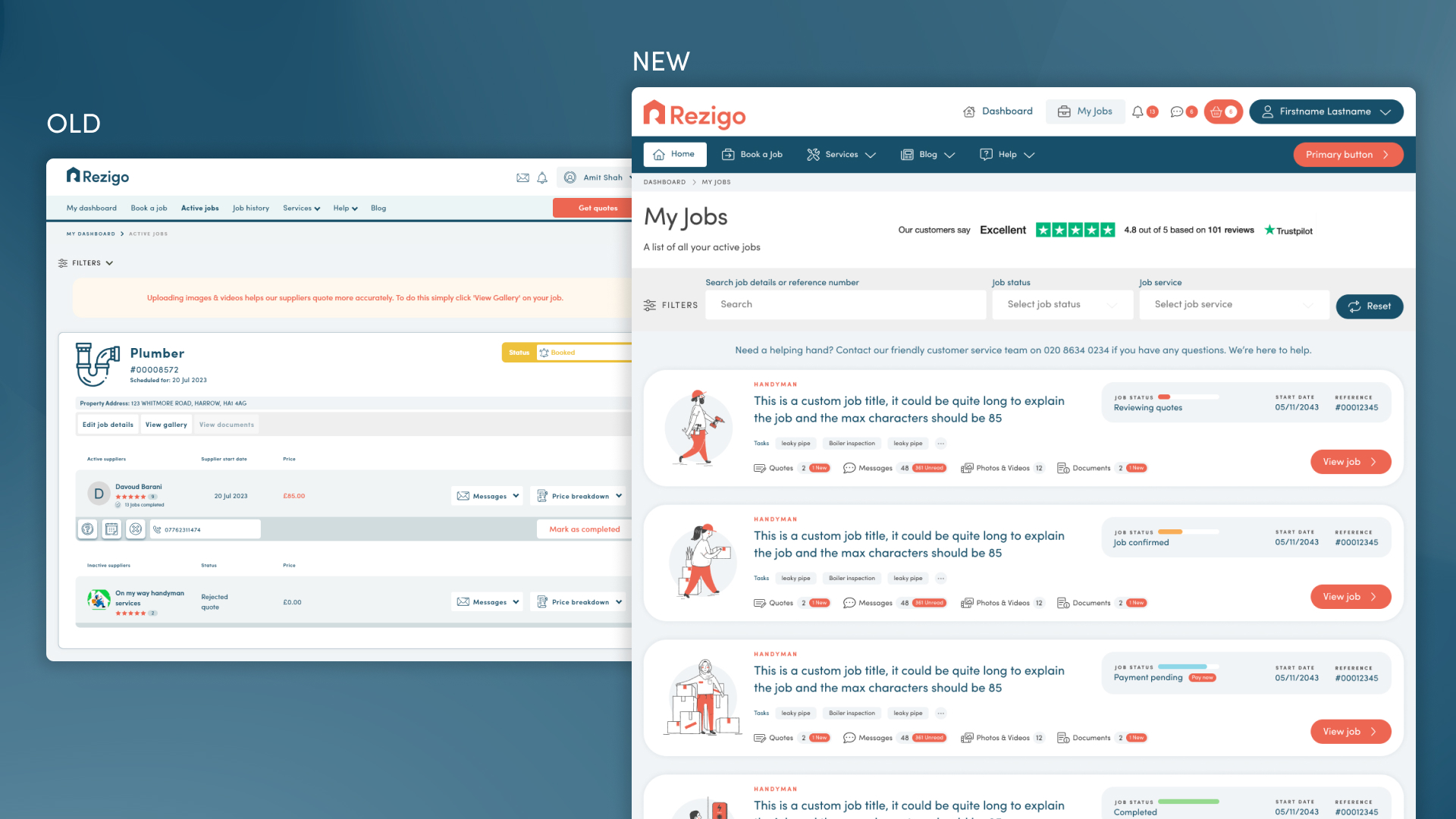
Redesigning the jobs pages
This part of the website was a key feature of the user experience, it would be the bread and butter of the platform and the pages that users visit the most. I needed to work on these first to cement the look and feel for the entire platform.
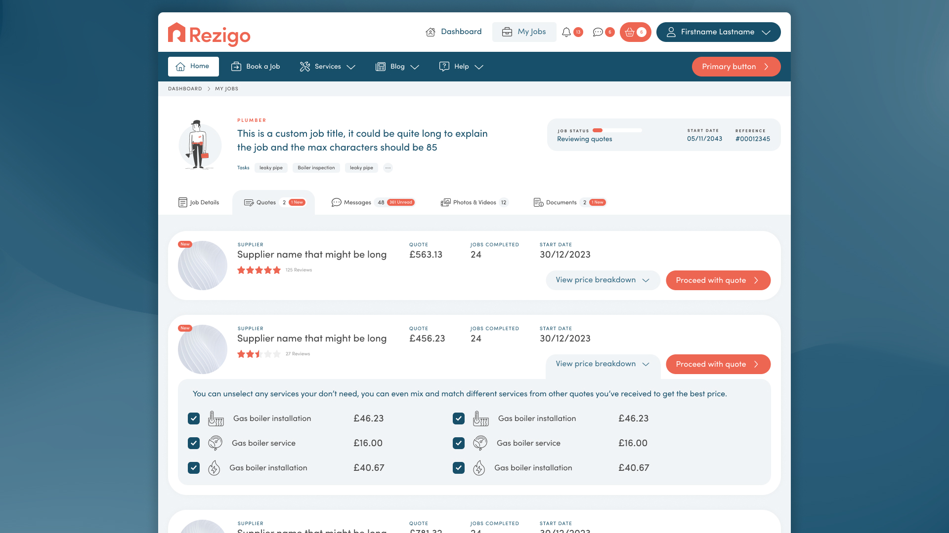
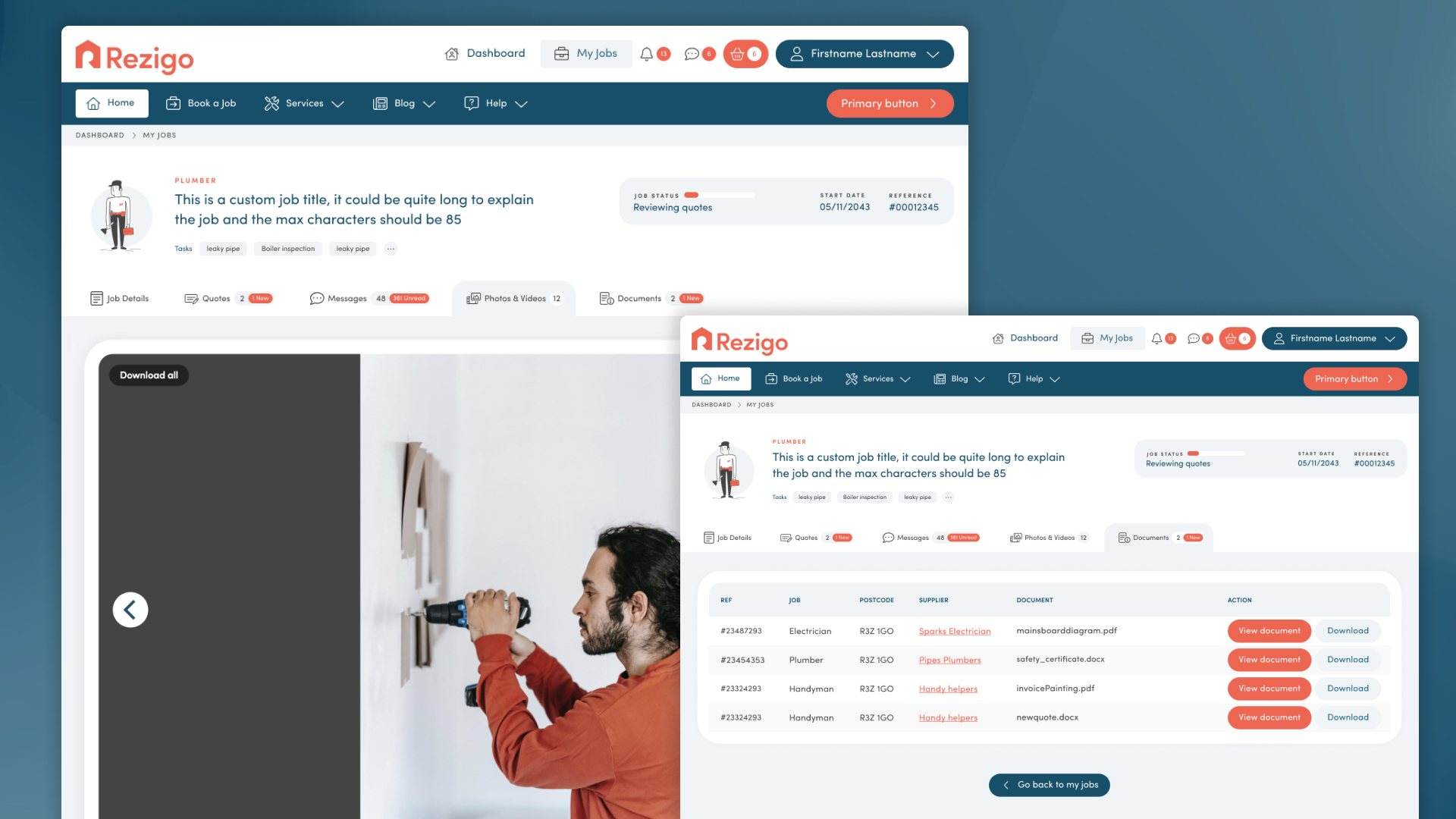
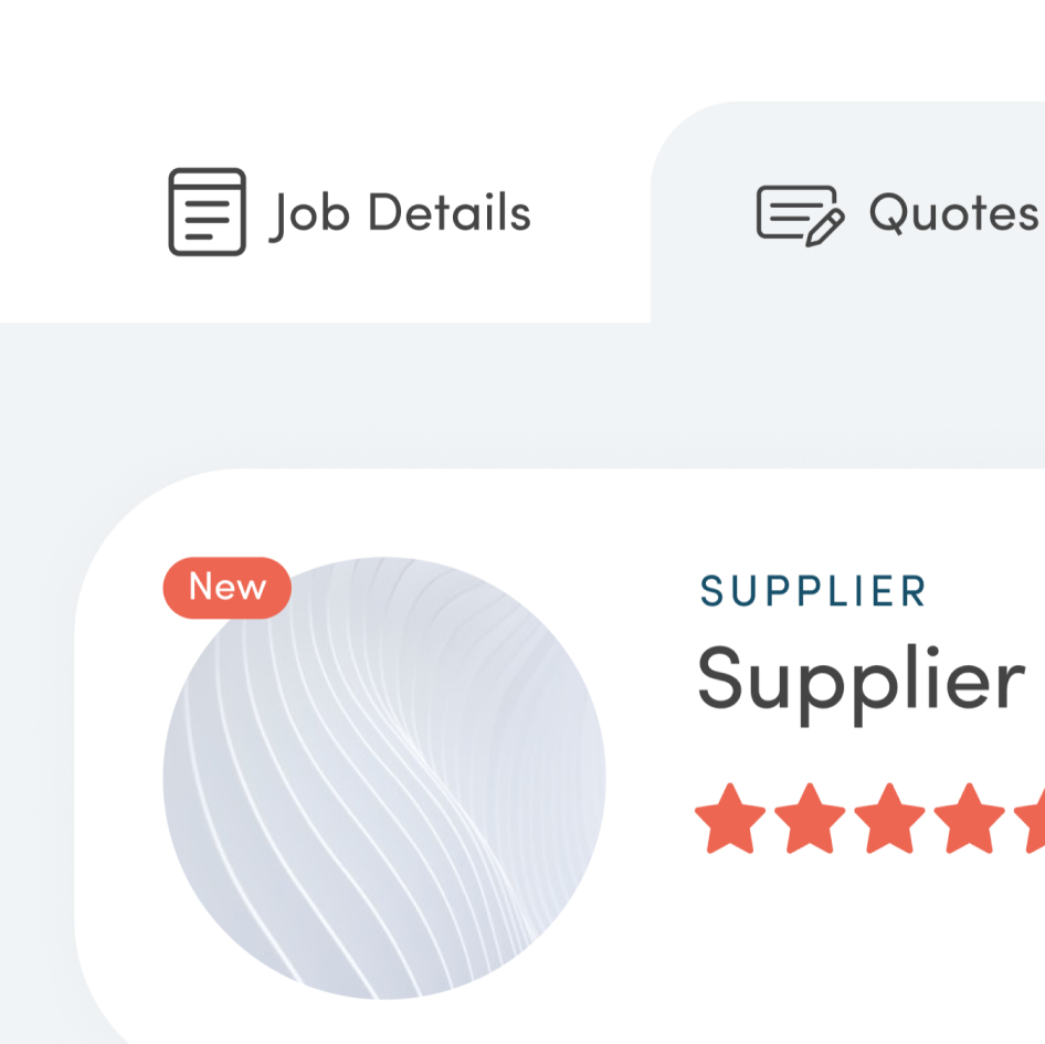
Quote comparison
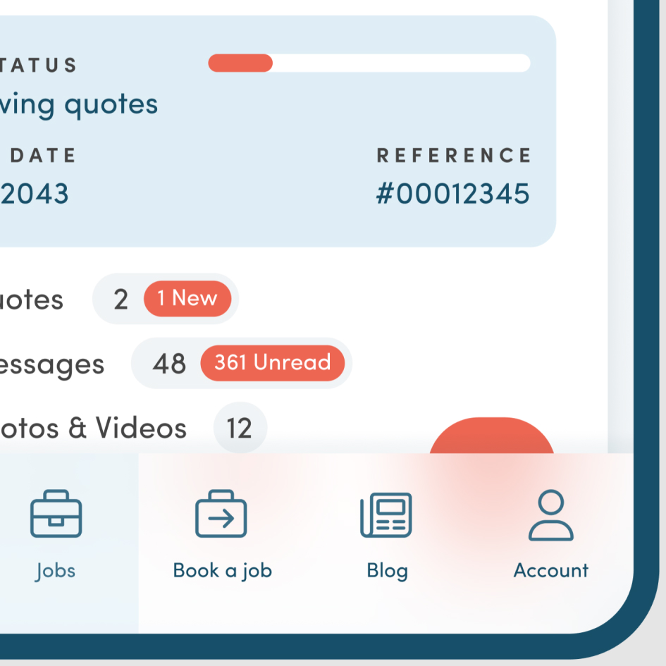
I moved all the job details onto a new page, resulting in huge improvements across the board. Each job would now have its own individual URL, this way the main 'Jobs directory' was decluttered and all the information was broken down into neat tabs. This page shows quotes from tradespeople that the user can then use to decide which supplier to book.
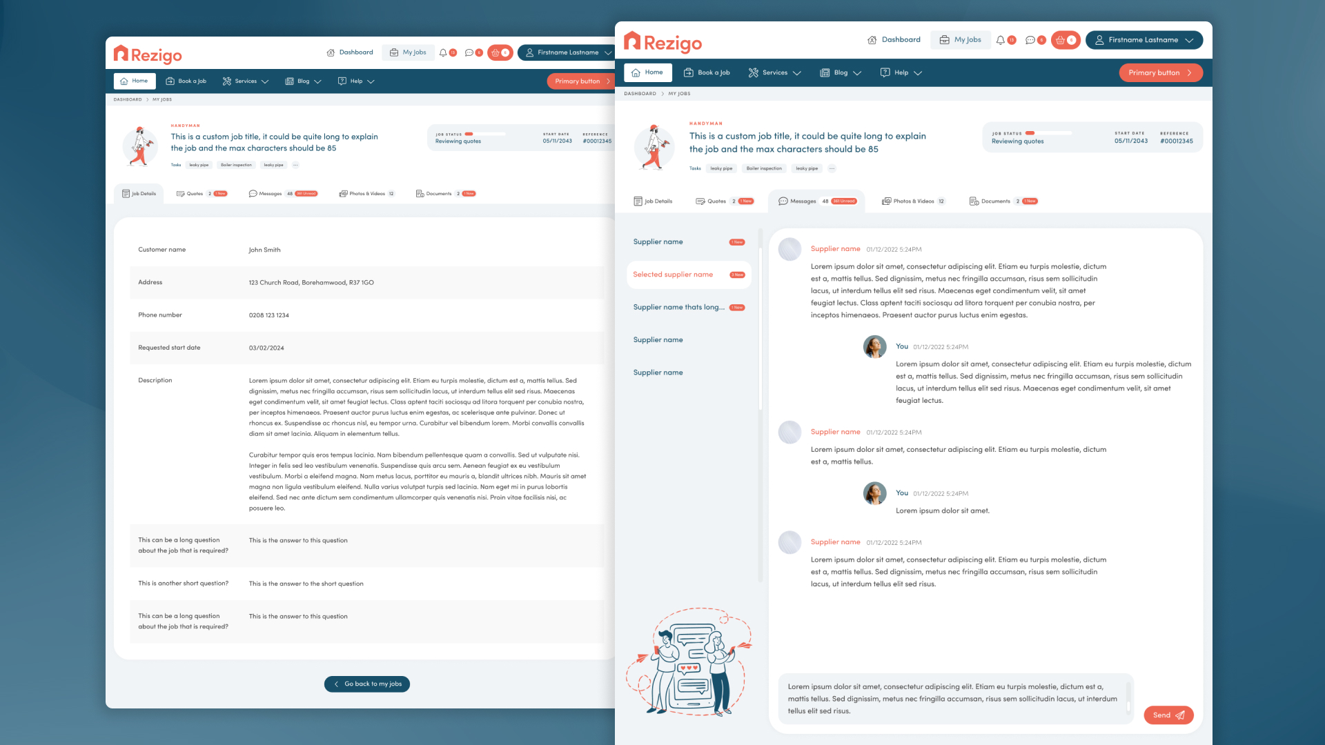
Job description and messages
Previously the 'Job description' was stuck behind a popup, I redesigned it to be clearer in a list format. The 'Messages' were also difficult to navigate, with each chat being in a dropdown menu below each individual quote. The 'Messages' also received similar treatment, I used a format comparable to popular chatting apps such as Skype, with clean navigation between different conversations.
Next steps
Being able to code clean HTML5 and CSS3 I knew that I wanted to bring my own Figma design into a HTML framework that I would build myself, ensuring it remains lightweight. I only used a grid system for layout and then begun work on translating my Figma designs into actual responsive HTML webpages, which would then be handed over to the developers to later implement in ASP.net. I focused on developing the design system and HTML framework in sync, component by component. Below are a few of the highlights that gave the brand a strong identity and tied together all the interface in a cohesive way.
Small details
These are the parts of the site that aren't so obvious but add vital information like notification dots, unread counters and custom scroll bars with handle. These all help tie the branding into the interface, as no element is left in its default browser state, even the checkboxes and radio buttons have been styled, making everything feel special and custom to Rezigo.
Mobile layout
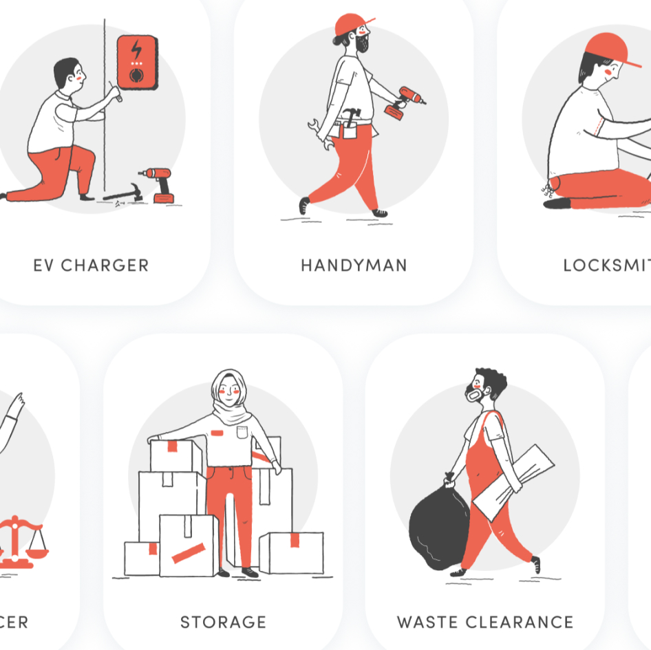
Making sure the website behaved like an app when viewed on mobile was important, I shifted five of the key menu items below into the navigation bar making it easier to use on a phone as touch targets are better lower down on the screen. The app when developed would also use this same design.
Results
The upgraded UX/UI left stakeholders and developers excited to roll the website out to the public, the design was highly praised to be more forward thinking and robust for scalability.