Case Study 03
Reinventing a platform for comparing pension provider data
- ClientDefinite Article Media
- SectorFinancial, Pensions, Investing
- My RoleDesign from research to conception, branding, full stack development
- SkillsHTML5, CSS3, JavaScript, JQuery, PHP, MySQL, WordPress, cPanel
- Project Time6 months
- Established2019
Introduction
CapaData approached Adrich to build a new version of their existing platform, it's a new way for the UK to track various pension funds' performance.
Their old site was sluggish, tired looking with a squashed narrow layout and very little spacing for the data to be easily digested by readers.
They were looking for someone who could help with both front-end design and the back-end data handling. I was to be the sole developer on the project as we had plenty of time to complete this project.
Challenge
The main challenge didn't lie in the design, I knew that by adding a nice colour palette and plenty of space between tables and charts with navigation that made sense we could achieve results far greater than their old site with relative ease.
The biggest challenge was adding all the new data sets they required for the build into WordPress. This meant adding new tables and charts and designing them in a way where it could work responsively too. Since there were a lot of new features and additions they wanted, it had to be built and designed at the same time as there were too many unknown elements being added in.
Optimising the process of adding new data was also a task they wanted us to undertake, however the client didn't know themselves the best way to achieve this, they looked to me to find a solution.
Existing website
The below shows how their existing website looks, it's clear that the site has had elements added to it overtime and the design and branding hasn't been defined to add much needed uniformity to the colours and layout. It's functional on the front-end, without design being an important factor. The back-end was disorganised with outdated plugins and messy theme code that needed to be built again from the ground up.
Plan
I would begin by taking a copy of the site and stripping out the plugins that were not needed, the all-important 'wpdatatables pro' plugin still seemed the best choice for the client and their data needs, and was also in need to updates. I would keep that plugin and a fresh WordPress install and first worked on the data alone. By optimising the amount of tables needed, I ensured any updates were simple for the client to carry out.
Once all the back-end data was in place, I would work on building templates for key pages, I would find a way to dynamically build pages using wpdatatables, and if possible make the site more database-driven rather than using actual WordPress pages.
Research
Solution
Executing my plan, I created a fresh WordPress installation and imported the data. I designed and built a brand-new theme specifically for the site.
I was able to identify what the most commonly used areas of the site were and focused my design on that, building out brand guidelines using the 'Provider' page allowed me to get all variations of content designed and styled in a consistent way.
Database driven site
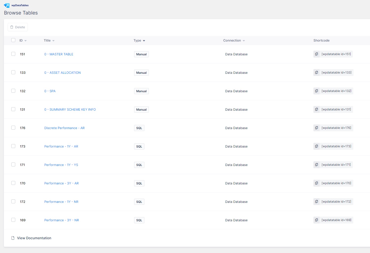
The site previously had over 40 tables that had to be painfully updated every quarter by the client, this took them many hours. I therefore found a way, using the power of MySQL queries, to automate a lot of the tables and charts that they needed. I managed to get all the data down to just four 'master' tables. This meant a quick update to these four tables would allow all the corresponding MySQL queries to autogenerate new charts and tables, saving the client hours of manual input.
The old site had a physical page setup for each provider of which there were many! If anything had to be changed, it was a laborious manual process to do so. I built a template for the provider page, using 100% fully dynamic data, when this page is populated there is only one template and all content is loaded in via database. The URL is responsible for querying the database and pulling in all the data. This takes the site one step further than even WordPress capabilities.
Beautiful Data
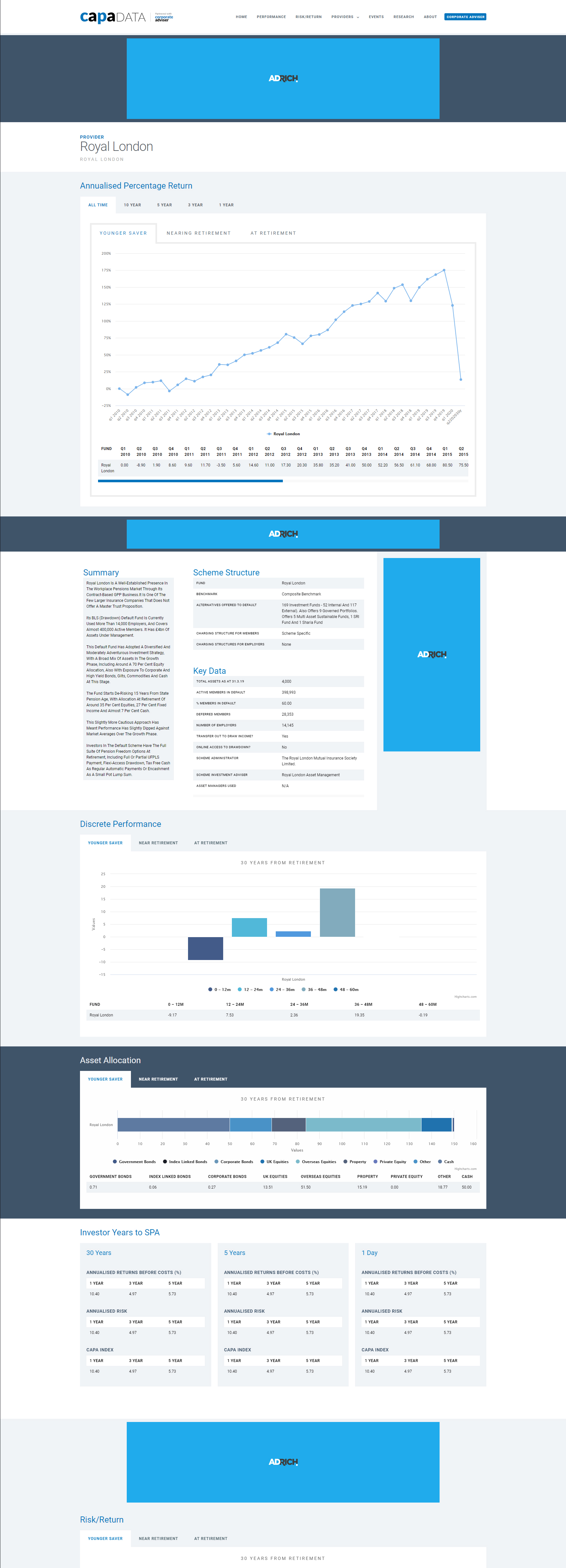
It's always a challenge to make text/data heavy pages look good, I looked to infographics for inspiration to help aid in making the page look nice and interesting. Breaking up the data with full width solid colour sections, some with ads placed discreetly within them acting as a divider.
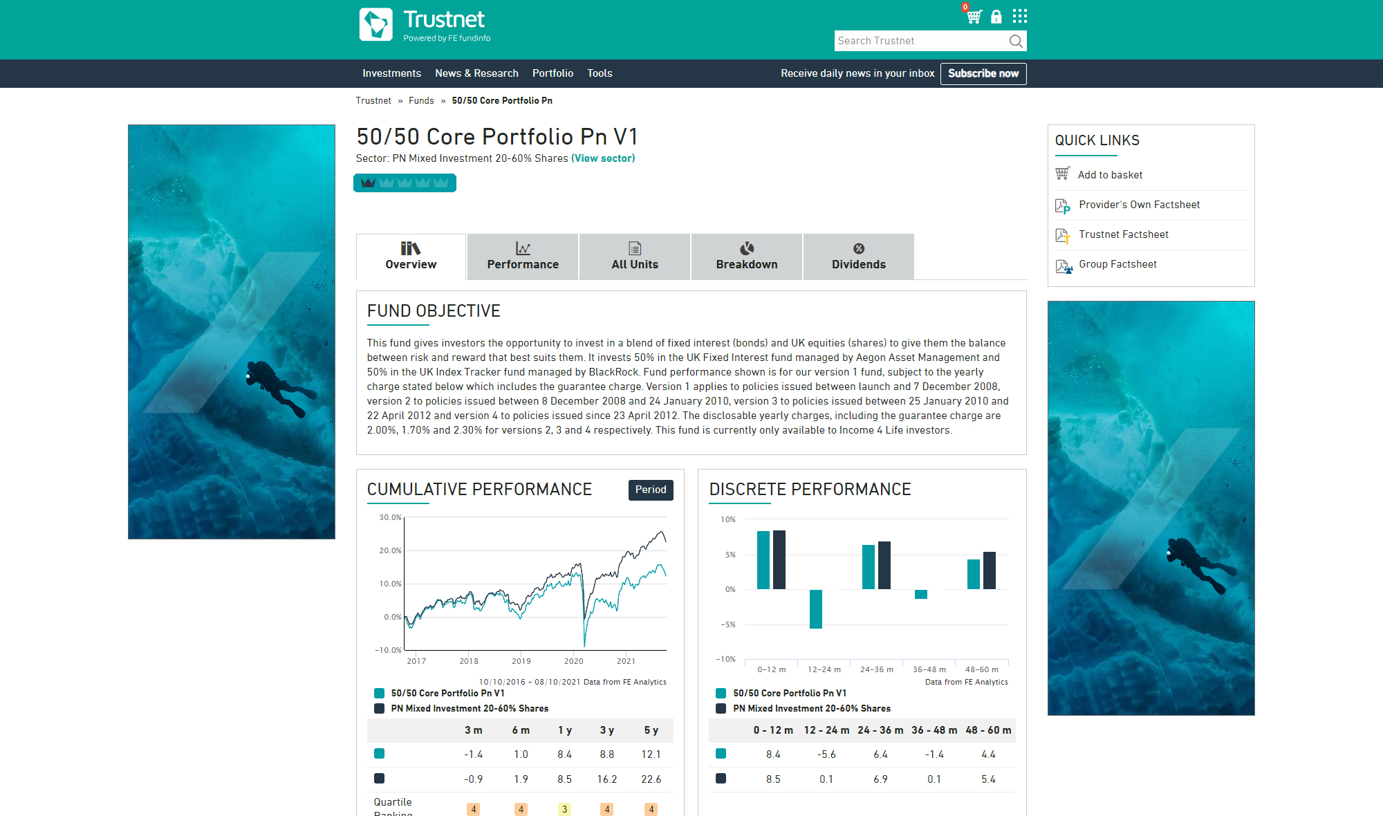
The Annualised Percentage Return was previously on separate pages and difficult to navigate. The client needed further sections within this to load a total of 15 charts! I wanted to make it all load smoothly using tabs within tabs, as this would keep things organised and without the need for separate pages.
The data, alongside a summary was good information, and I wanted it to be shown together in the same view. Using a magazine-type layout to show this helped break up the page from horizonal content and made the summary seem less daunting to read. Tables were also modernised with their original black borders removed.
Part of making the page database driven meant pie charts didn't really work well, while I would have liked to use them, it wasn't possible with the dynamic nature of the site. Consequently, I switched to a chart that was horizontal and showed percentages of the Asset Allocation.
Making large tables responsive for mobile was a big part of this redesign, Investor Years to SPA is a perfect example of how breaking up three data sets allows me to stack these when mobile.
Results
The client is really happy with the new design and heavy optimisation done to the databases; it saves them countless hours of updating the site each quarter. I'm sure once finally launched it will see an increase in the number of visitors and dwell time. There are still more features that the client wants to add before going live, thanks to the new design it's snowballed into something greater than they envisioned.